はじめに
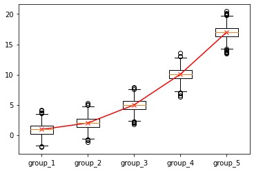
今回は箱ひげ図に中央値の折れ線グラフを追加する方法です。
実装
ライブラリ
import numpy as np
import pandas as pd
import matplotlib.pyplot as plt
ダミーデータ
df = []
sigma = 1
for i in range(5):
    df_tmp = pd.DataFrame({
        "group": f"group_{i+1}",
        "value": np.random.normal(loc=i**2+1, scale=sigma, size=1000),
    })
    df.append(df_tmp)
df = pd.concat(df, ignore_index=True)
可視化
def plot_box_and_line(df, gruop_col_name, value_col_name):
    labels = np.sort(df[gruop_col_name].unique())
    hist_data = []
    median_data = []
    for label in labels:
        df_tmp = df[df[gruop_col_name]==label][value_col_name]
        hist_data.append(df_tmp.tolist())
        median_data.append(df_tmp.median())
    plt.boxplot(hist_data, labels=labels)
    plt.plot(range(1, len(labels)+1), median_data, marker="x", color="red")
    plt.show()

plot_box_and_line(df, "group", "value")
さいごに
以上です。 箱ひげ図の傾向を可視化させるときに活用しましょう。